
Disney World Debuts Cleaner New Website
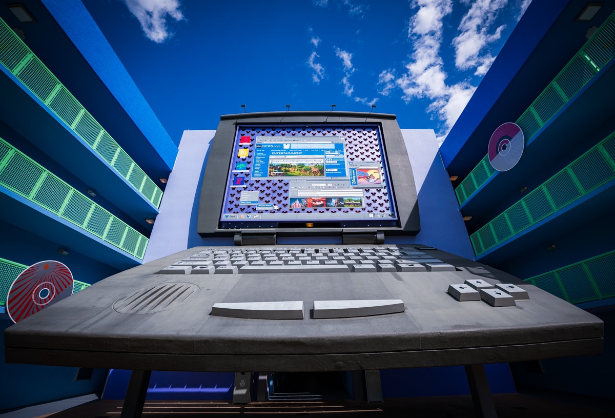
Walt Disney World has started rolling out major updates to its digital services that are aimed at simplifying booking and planning vacations. This shares a first look at some of the changes, and what else to expect in the months to come. Spoiler alert: the Go.com portal is alive and well, and will outlast us all, just as Michael Eisner intended.
As we first reported back at the start of Cool Kids’ Summer approximately three months ago, Walt Disney World will be making big changes to its website and the My Disney Experience app. We learned about this during a presentation from Walt Disney World Product Management, Guest Experience, and Commercial Strategy departments discussed what to expect from the upcoming changes.
They offered us a sneak peek of the upcoming app and website changes. At the time, the layout and features were a work-in-progress and subject to design tweaks before launch, so we did not have accompanying visuals. What we saw looked largely fantastic, and completely consistent with what launched today (I don’t have a photographic memory, so I can’t say it’s 100% the same, but it’s very similar). While I’ll always hold a soft spot for our cluttered and chaotic layout, the clean design is a breath of fresh air.
This actually kicks off the fifth or sixth round of modernizations to the Walt Disney World websites and app aimed at improving the user experience in the last couple of years. Thus far, they’ve all been fantastic.
Prior to this, the miracle of in-app park reservations finally occurred. Many of the biggest improvements have revolved around the Advance Dining Reservation (ADR) and Lightning Lane systems, and they’ve been big wins for ease of use.
This site is often critical of Disney IT or skeptical that things will go smoothly, but I can’t think of a single complaint about any of the changes made in the last few years. They’ve been great. This is most noticeable with Advance Dining Reservations. We have spent far less time doing the whole dance–searching, refreshing, rechecking, and so forth. The process has been painless and simple.

Walt Disney World shared with us that they’ve seen measurable improvements in guest satisfaction as a result of the changes. For example, combining “Today’s Plans” and “Future Plans” into the cohesive “My Plans” flow on MDX improved ease of use by 8%. Streamlining the ADR booking flow and search improved guest satisfaction by 5% and drove record-high website ratings.
Likewise, the switch from Genie+ to Lightning Lanes coupled with the shift from day-of booking to pre-arrival reservations led to double-digit gains in both ease of use and overall experience. I’m not surprised by this in the least. We knew that guest satisfaction scores were a big driver behind the switch from Genie+ to Lightning Lane Multi-Pass and Single Pass, even if a vocal minority of power users (us included!) preferred the same-day system.
DisneyWorld.com Updates
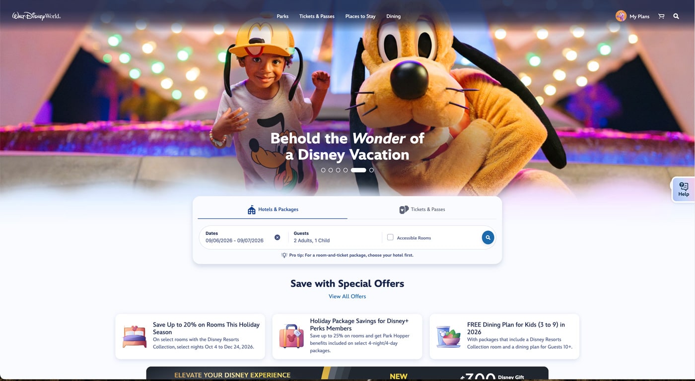
During our presentation, Walt Disney World leadership revealed that changes would be made to the website experience to streamline complexities that exist with finding vacation packages, hotels, tickets, special offers, and more.
This was driven by some guests visiting and revisiting the website 20-30 times before booking. The updates are meant to reduce this friction, and make it easier to compare pricing across dates, resorts, discounts, etc.
Although they haven’t all rolled out yet, new features coming to DisneyWorld.com will include flexible date searches, price comparison calendars, side-by-side resort hotel comparisons, AI-generated summaries to highlight relevant details or differences.
One thing I would note here is that some of these comparison tools already exist, but just aren’t highlighted well (or don’t work well). Moreover, while the flexible price calendar currently exists and works well for tickets, a similar feature used to offer a monthly view of hotel rates. For reasons beyond me, that has either been discontinued or hidden.
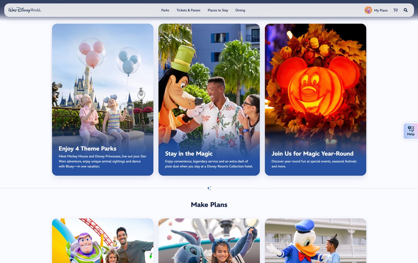
At present, the changes are largely in layout and navigation. The top navigation bar is simpler now, with far fewer options. The menu also has a translucent appearance that evokes Apple’s Liquid Glass design.
The new top middle navigation bar reduces the options to the following:
- Parks
- Tickets & Passes
- Places to Stay
- Dining
There’s also a “My Plans” menu on the far right, along with a shopping cart and search.
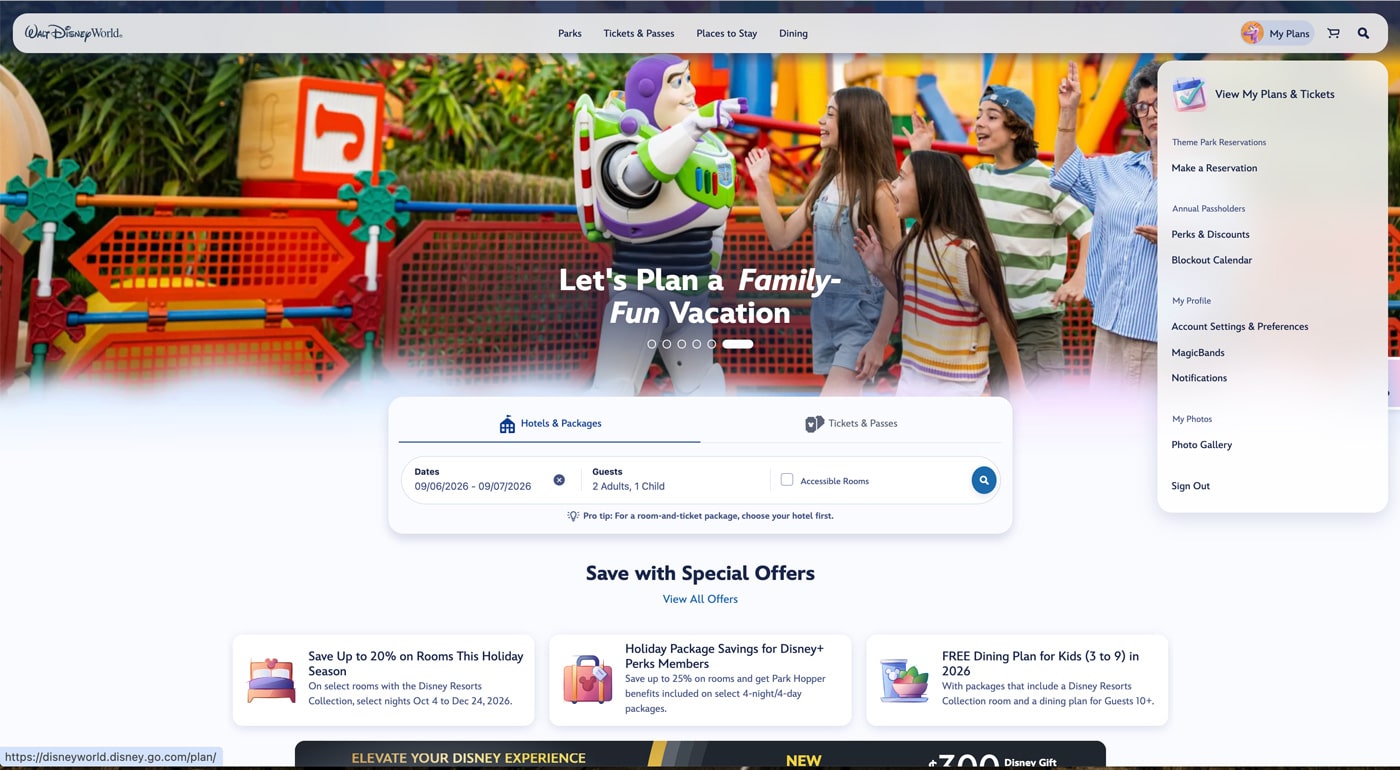
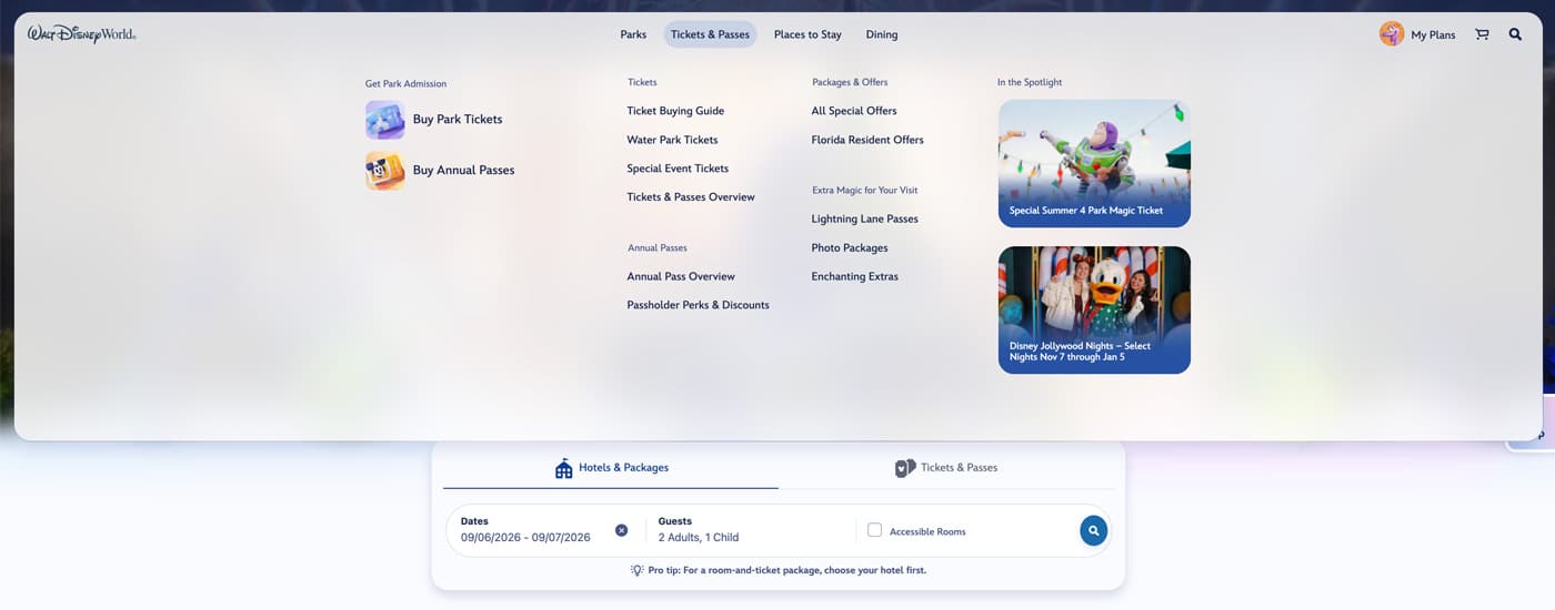
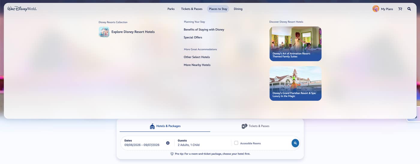
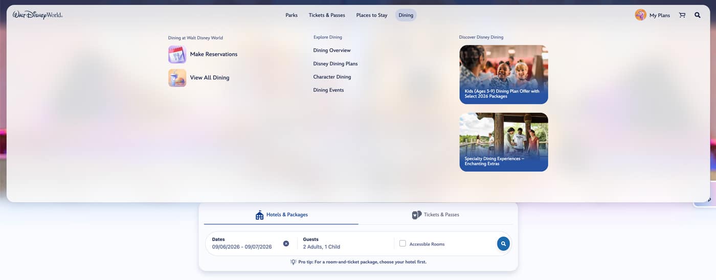
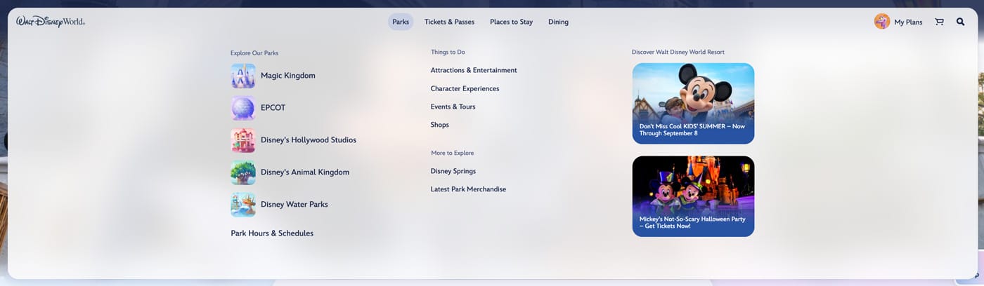
Hovering over any of these reveals a lengthy dropdown that has the priority options on the left, a more jam-packed middle, and then spotlight tiles on the right.
From the best I can tell, these sub-menus include everything that was there before, just with a cleaner, surface-level starting point. (I did have a bit of trouble finding park hours–it’s under “Parks” and then at the bottom on the far left.)
Based on what I see, there are no substantive changes to the various webpages beyond the redesigned homepage.
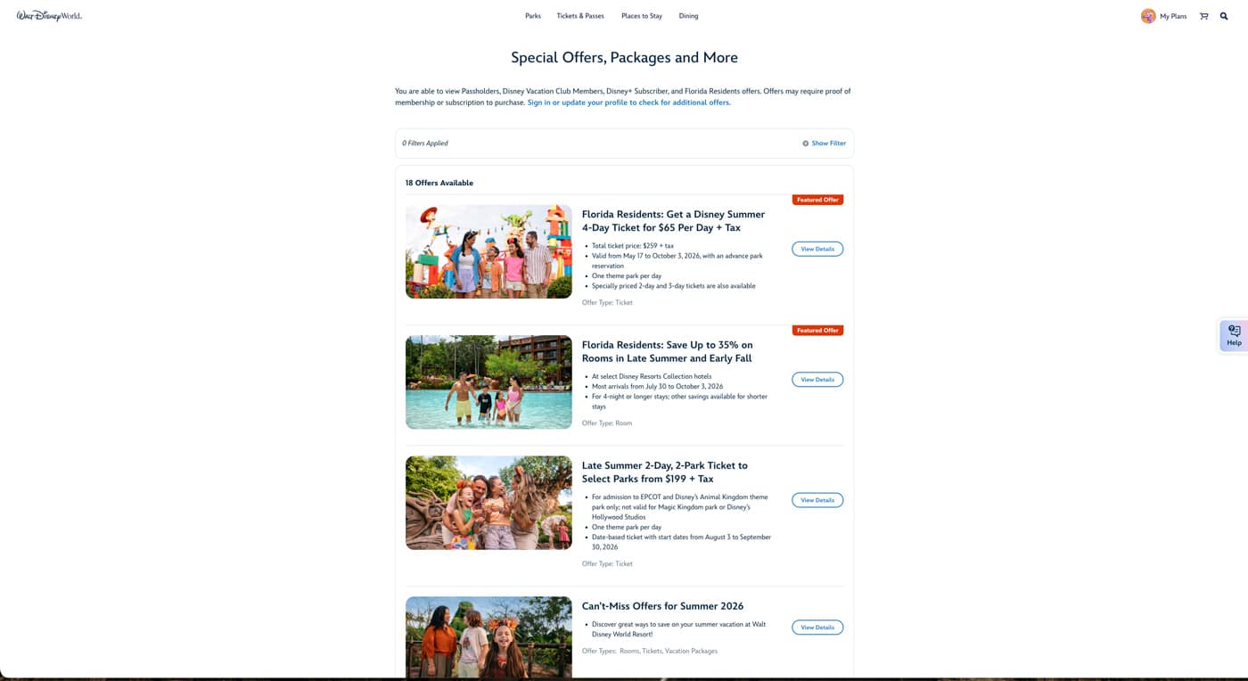
Once you get past that, the new top navigation bar remains, but the pages look as they did before. There were a few (largely cosmetic) updates that have rolled out over the last few weeks, including simpler menus and booking flows. But not much in the way of material changes. The big one thus far is the homepage.
Although it’s a very niche concern, one thing that stood out to me is the removal of the utility bar above the main navigation menu. Most importantly, this included a country and language selector, which I used with shocking frequency.
For whatever reason, DisneyWorld.com often thinks that I live in Canada, and no matter how many times I change that, it keeps reverting. Canada is a lovely place and I could see myself calling Vancouver (one of my favorite cities in the world) or Toronto or Calgary home…but I don’t. And this is actually more of an issue than you might think, as the Canadian version of the site is (or was?) often oddly outdated. But I digress.
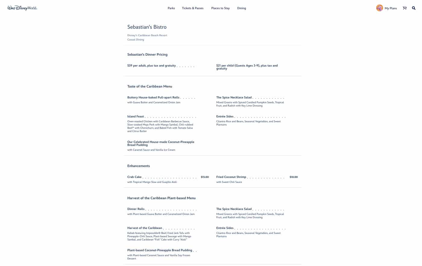
There are a bunch of other minor changes to DisneyWorld.com, which may be meaningful to you, personally.
I’d recommend heading over to DisneyWorld.com and poking around, seeing what you think and how (if at all) this impacts you. If there’s something significant, please report back!
Based on what we heard earlier this summer, the website updates are the first of many upcoming changes. The big one will be an overhauled app, which does not yet have a firm rollout for deployment. We were told they would begin launching in phases at Walt Disney World in the coming months, and then at Disneyland in the months after that.
I wouldn’t be surprised if it takes until October 2026 for the new app rollout at Walt Disney World, and early 2027 at Disneyland. As a refresher, here are the other upcoming digital changes that Disney announced…

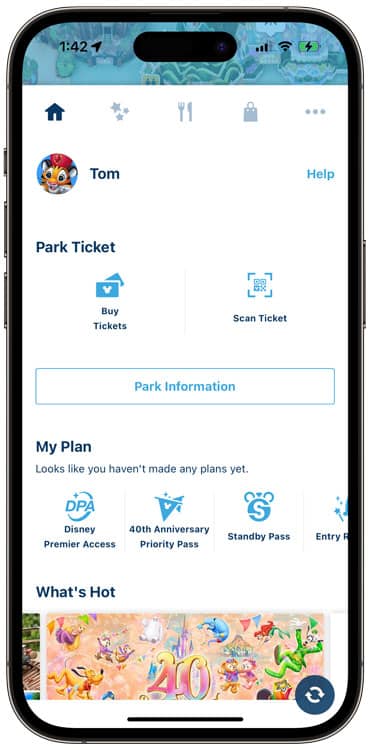
Cleaner App Home Screen
Everything is oriented around the guest’s upcoming trip on the new-look home screen, which ditches the neverending tiles in the current apps in favor of a cleaner and simpler style that pulls in reservations, travel parties, and planning reminders.
Leadership acknowledged that one of the biggest guest complaints is navigating the app and finding information that’s relevant to them. With the redesign, everything that guests need will be front and center, and easily accessible.

Trip Planning Checklist
One of the top additions is a new trip checklist feature. This is intended to reduce the anxiety that guests feel when planning, especially first-timers who may not know the key pre-planning milestones, such as booking ADRs and making Lightning Lane selections. (I will personally appreciate the latter, as I’m constantly forgetting when this window actually opens.)
They mentioned that this will include not just a checklist, but also calls to action, such as to add your park tickets to Apple Wallet so you’re not scrambling at the tapstiles. All of this is separate from the hotel check-in checklist, which includes adding your credit card on file, making room requests, etc.
This version is more akin to what Disney Cruise Line uses, and in fact, leadership referenced DCL as a template of sorts for this new feature. If you’ve never used it, the Disney Cruise Line user experience is pretty good. Definitely more straightforward than MDX, but then again, DCL is a simpler type of trip!
New Trip Party
The current process for sharing plans with family and friends is tedious, to use a charitable term. You have to send an email (hoping that you’ve chosen the correct one), and then wait for acceptance. You have to deal with managed guests and more.
Leaders shared that the new version of sharing travel plans will be as easy as sending a text message. Walt Disney World will use industry-standard native device capabilities to pull in contacts from your phone.
From there, you can simply tap the contact and send them a link to the trip. They click that link, accept the invitation, and are added to the trip. It’s as easy as that.
Whereas the checklist feature is inspired by DCL, this trip party feature reminds us of the Tokyo Disney Resort app. WDW leaders did not invoke that by name, but it seems like they’re applying the best lessons learned at other Disney destinations around the globe.

AI Search Results
One of the big changes is coming to the search experience. Bluntly, search is broken in the current version of the app. It spits back a long list of results that may or may not be related to your query. As the industry moves towards making it easier to get answers to their questions directly in results, so too is Disney’s approach changing.
The new search experience will use AI to answer questions in a simple summary pulled from Walt Disney World’s resources, so guests don’t have to read through multiple FAQs or browse through unrelated results. It’ll offer the ability to dive deeper if guests would like, but the goal is an up-front summary that quickly answers most questions.
I’d envision this working similar to Google AI Overviews. Hopefully, unlike that, Walt Disney World’s AI powered search results won’t be frequently (confidently) wrong. Utilizing AI in this way could make sense, although I’ll continue verifying the results since I don’t trust AI to not hallucinate or produce outdated answers.
Given that Disney’s search isn’t great to begin with and even official sources often contain bad or outdated information, I don’t have super high hopes for this. (PlanDisney, in particular, is wrong all the time. And not just with outdated info that has changed since publication. Answers are often incorrect when given!) This AI search could work well, but we shall see.

Why is Disney Making These Changes?
Disney’s goal is to reduce friction, streamline the booking process, and make planning easier. That sounds great, and the new-look homepage and navigation bar is a good start. After the ADR changes, I have more faith in Disney IT being able to deliver results with all of these features.
Disney IT has delivered several improvements over the last few years, and although the product still isn’t perfect, it’s headed in the right direction. Everything recent has been thoughtfully done, intuitive, and actually works. The user experience and interface have measurably improved. The app doesn’t crash as much, or send me in a neverending email verification code loop.
If everything works as advertised, these changes will be great for both diehard Disney fans and first-timers. They’ll make every facet of the planning process easier and more intuitive, which is a sharp contrast to today. Sure, it works for power users (presumably you, if you’re reading this).
All of this has been incredibly unintuitive for the uninitiated in the past. This changes that, and helps bridge the gap between first-timers and power users. As advocates for removing as much friction as possible from Walt Disney World vacations, we’re cautiously optimistic about these proposed improvements.
Walt Disney World has done a lot to even the playing field and make it easier for casual guests. While some fans have bemoaned certain changes (like shorter booking windows), these have been largely positive changes on balance for most average visitors.

We’re very pleased with these enhancements slated to roll out to the apps at Walt Disney World and Disneyland in the coming months and (presumably) into 2027.
Given the success of the updates to the restaurant reservation booking systems on both coasts, we find ourselves in the unprecedented (and frankly, uncomfortable!) position of being more optimistic about what Disney IT is doing.
Unfortunately, all of this is going to be rendered obsolete once that big beautiful super app launches, but the changes should be guest friendly ones until that totally real app is realized.
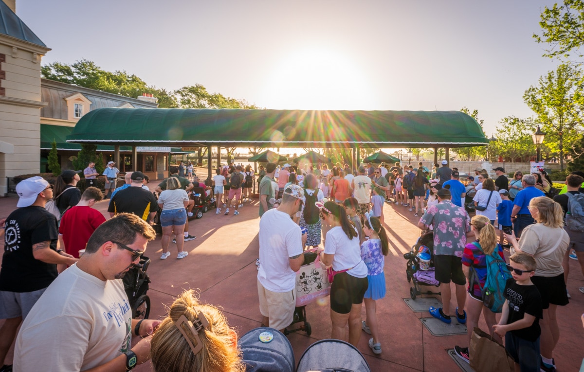
Finally, there’s also the reality that “simplifying” the user experience mostly comes down to cosmetics. To be sure, that does make a meaningful difference! But at the same time, the reason DisneyWorld.com and the My Disney Experience app are so complicated in the first place is because visiting Walt Disney World is so complicated.
Disney’s IT team is making a laudable effort, but there’s only so much they can do to reduce complexity since the underlying issue is the complexity of the core guest experience. They can remove or deprioritize a bunch of lower use features and pages, but everything there serves a purpose, and if features are indiscriminately moved, that’s going to impact guests. The truly meaningful path to simplifying the user experience on Disneyworld.com or MDX is…simplifying the guest experience at Walt Disney World.
Planning a Walt Disney World trip? Learn about hotels on our Walt Disney World Hotels Reviews page. For where to eat, read our Walt Disney World Restaurant Reviews. To save money on tickets or determine which type to buy, read our Tips for Saving Money on Walt Disney World Tickets post. Our What to Pack for Disney Trips post takes a unique look at clever items to take. For what to do and when to do it, our Walt Disney World Ride Guides will help. For comprehensive advice, the best place to start is our Walt Disney World Trip Planning Guide for everything you need to know!
YOUR THOUGHTS
What do you think about the cleaner DisneyWorld.com homepage and navigation? Any other features on your ‘wish list’ for the website or apps? Agree or disagree with our assessment? Any questions we can help you answer? Hearing your feedback–even when you disagree with us–is both interesting to us and helpful to other readers, so please share your thoughts below in the comments!




Please please let all this updating be done in a way that doesn’t further screw up international versions of the website. Disney’s complete lack of understanding that UK guests also need actual online stuff just like US ones really baffles me. I always just hope everything will stay exactly the same as change seems to quite often lead to some random set of features not arriving for international guests. We spend a lot of money and time on Disney World as a rule…. Some of us are even mad enough to be DVC members 🙂 🙂
Disney website crosses its arms, raises an eyebrow, and stares skeptically at your Midwestern politeness and love of beaver tails.
“Nice try. Back to the Canada website with you.”
Hey tom…
Calgary ?!? Really ?
Unless you like rodeos and the smell of gasoline, it’s not the best place to live in Canada.
I agree about Vancouver, but if you come through Montreal, I’ll show you some spots the whole family will enjoy—far better than Calgary.
Calgary is the gateway to the Canadian Rockies, one of my favorite places on earth. But I’d never live in Banff or wherever, because they’re just a tad too remote.
Montreal is high on my list of places to visit, as is Quebec City!
I’m exited for the improvements. I remember when you could put your trip in a suitcase to compare stays. I loved it!
I am SO happy that ADRs are so good for you. Those of us connecting from a UK IP address (which includes those of us using UK cellular data inside WDW) get redirected out of the app for literally no reason whatsover and forced to navigate the “UK” mobile webpage (which is no different from the US webpage). Yes, this even applies when trying to cancel a reservation, except that the app doesn’t bother redirecting you, it just fails with a vague error and you have to work it out for yourself. All works absolutely fine on US Wi-Fi so this is just pain for literally no reason.
Sorry if this comes across as sassy and bitter. Actually I’m not.
Are you sure you’re so happy for me? You don’t seem happy for me.
Seriously, though, it’s really odd how different versions of the WDW website are just broken (see my Canada aside) or don’t work from other regions. I had similar issues to what you’re describing when trying to book from France (country, not pavilion). In the end, I just gave up.
It’s obviously not perfect, and it seems that there’s still a patchwork of legacy systems underpinning all of this, but the latest changes have been steps in the right direction.
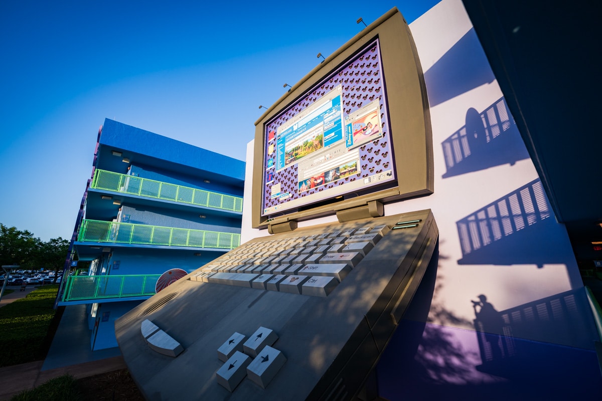
That’s a great “cover photo” for the post, with the shadow self-portrait at bottom right. Nice visual metaphor for how you’ve stalked the archaic Disney website all these years.
Nothing will remain except-
Cockroaches
Twinkies
Go.com portal
(Bonus for my fellow Floridians: love bugs)
This is very unrelated, but I just realized I haven’t encountered a truly awful love bug season in a few years! Maybe just luck on my part or less exposure since we’re no longer locals, but ~2018 to 2022 had some truly bad years.
Ha! Yes, it is amazing that go.com is still around. I agree with Tom that the recent Dinsney UI/IT changes have all been positive. I hope the website update is as well. It’s functional as-is, but could use some upgrades.