
The Trouble with Tomorrowland (New Paint Photo Update)
Tomorrowland has an identity crisis. This is becoming increasingly clear in Magic Kingdom, but it’s hardly a problem unique to Walt Disney World. With the exception of Shanghai Disneyland, every Tomorrowland has this same issue to varying degrees, and it only gets worse with the older parks.
It’s certainly true at Disneyland, which is still recovering from its New Tomorrowland project that brought Rocket Rods and brown paint to much of the land in an attempt at faux Steampunk. It’s also true at Tokyo Disneyland, which is currently contracting the footprint of its massive Tomorrowland with a medley of designs from several eras. And it’s true at Magic Kingdom in Walt Disney World.
In this post, we’ll take a look at some of the ongoing changes to Tomorrowland in Magic Kingdom, and what we might expect as the land expands and receives yet another aesthetic with TRON Lightcycle Power Run. We’ll also share some photos of the new paint scheme, signage, and other details that have recently changed in Tomorrowland.
Since some of you probably aren’t interested in my commentary about an ‘ideal’ Tomorrowland 2021, let’s start with the construction and project update photos and then shift gears to discuss the future of Tomorrowland…
First, the new color scheme. This starts with a creamy orange above Merchant of Venus and Auntie Gravity’s Galactic Goodies, which continues in a dark tangerine shade near the ground before switching to yellow near the restrooms.
Above the restrooms is a pastel purple, and below them to the right begins a turquoise pattern that juts up above Mickey’s Star Traders.
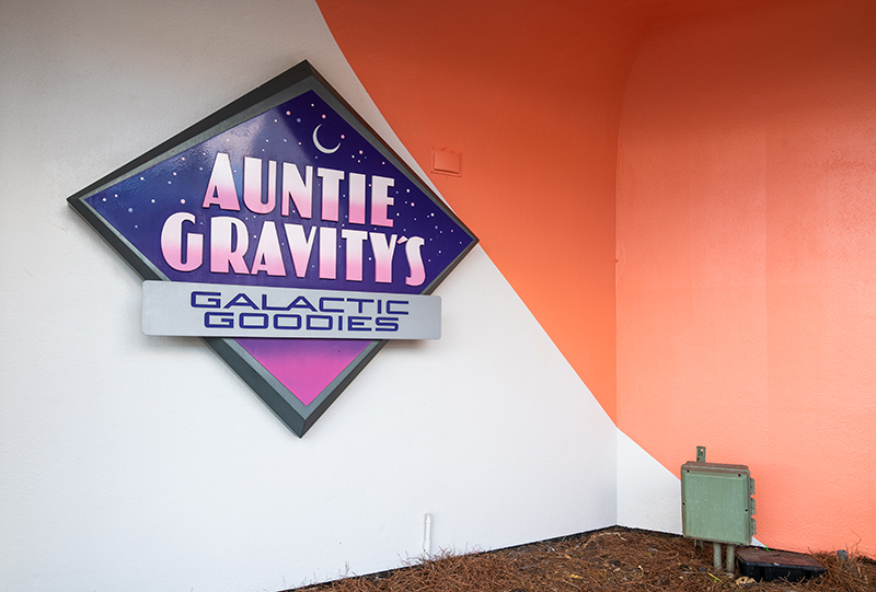
Here’s a ground-level look at the Auntie Gravity’s Galactic Goodies signage.
There are several pastel colors used here, and the combination of colors and patterns gives this area a decidedly 1980s vibe.
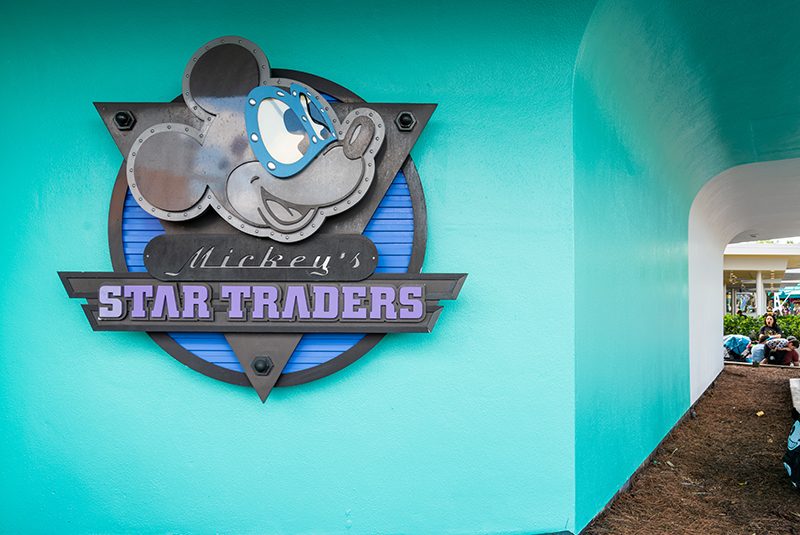
Here’s a look at the new paint scheme around Mickey’s Star Traders.
Plants here had been removed a few weeks prior, and now we know why.
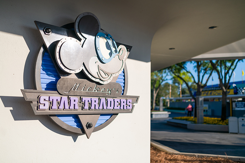
I actually took a photo with the plants removed just before the repainting began, as I thought it was a rare chance to capture the signage in isolation. Little did I know what was about to happen!
Personally, I don’t think the result here is a good one. They’ve leaned a bit too much into the retro part of retro-futurism. Vibrantly colored walls are great for selfies, but arguably less so for futuristic themed design.
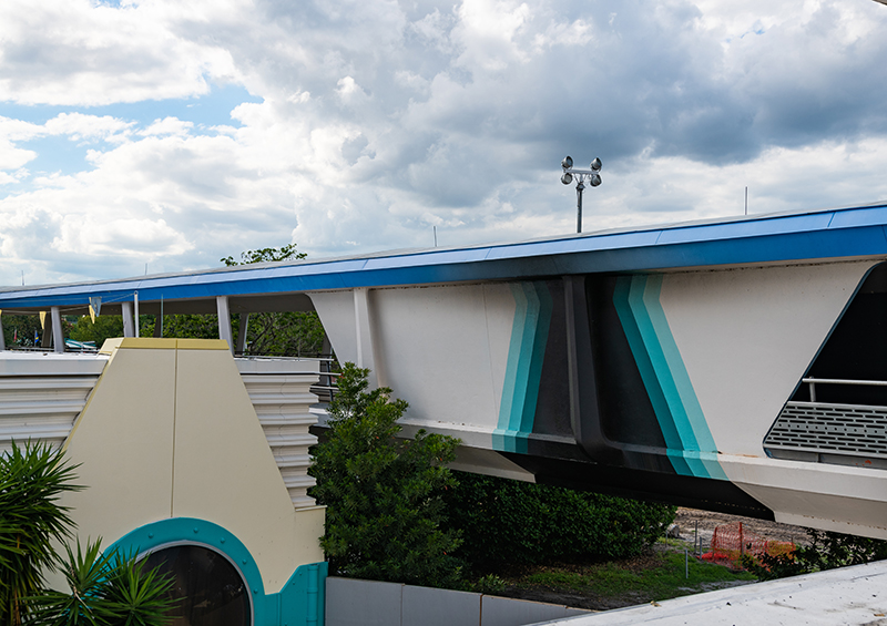
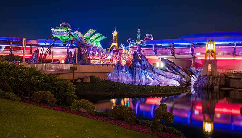
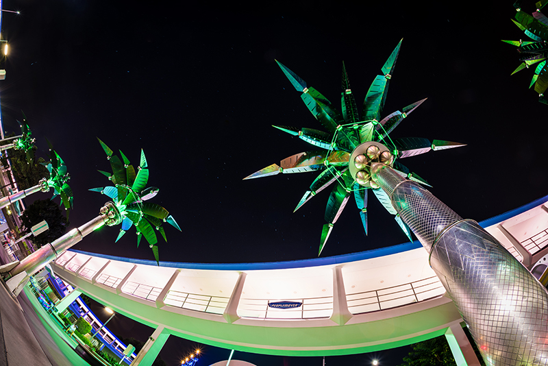
Worth noting is that this is far from the first repainting of Tomorrowland. The PeopleMover platform received a multi-colored scheme a couple of years ago.
However, my personal favorite is the paint above, from the backside of the PeopleMover track. I’m not sure to when this dates, but I’m guessing it predates Tomorrowland ’94.
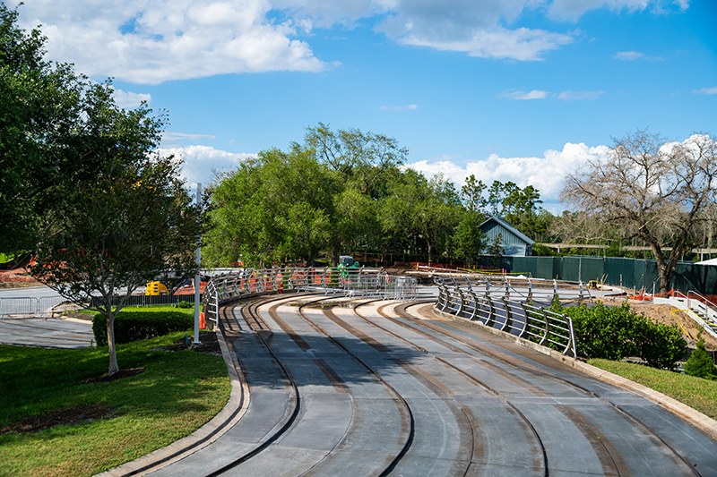
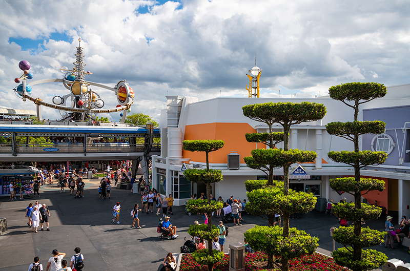
While we’re on the Tomorrowland Transit Authority, we might as well check in on the progress of the projects visible from above.
Tomorrowland Speedway looks pretty much the same as it did in our last Magic Kingdom update.
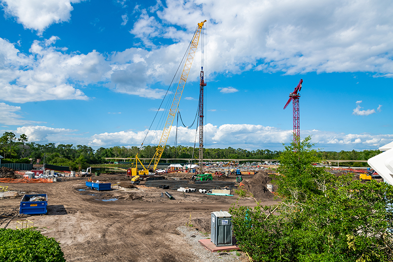
Ditto the TRON Lightcycle Power Run.
This isn’t to say work isn’t progressing–the construction site is quite active–it’s just that visible progress is difficult to convey in photos or video.
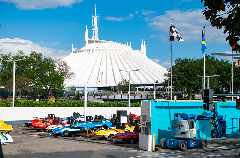
Back on the ground, we have a look at the fleet of vehicles with Space Mountain in the distance.
New cars from Tokyo Disneyland (which closed its version of the attraction to make way for the Beauty and the Beast mini-land) give the attraction in its current state a new lease on life, postponing any plans to modernize. That’s unfortunate, to say the least.
For now, I’m less interested in the huge substantive changes and more interested in the aesthetic ones.
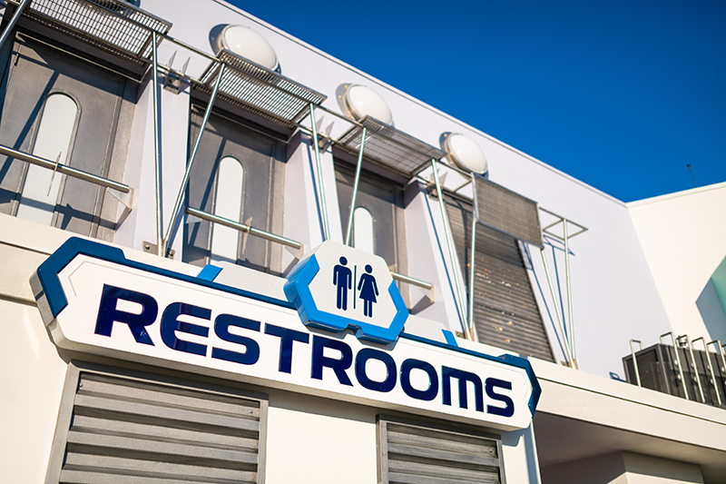
Another recent update to Tomorrowland was the refreshing of these restrooms. The interior is fine–generically modern, but it gets the job done–but what perplexes me is the use of the EPCOT Center ‘Prototype’ font. Tomorrowland isn’t Future World.
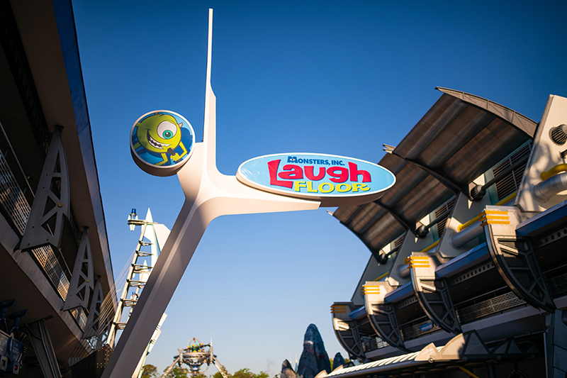
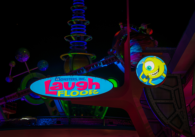
In a move that was praised last fall, the new Monsters, Inc. Laugh Floor signage offers an homage to the clean style of the original Tomorrowland.
However, it in no way fits with the rest of this corridor.
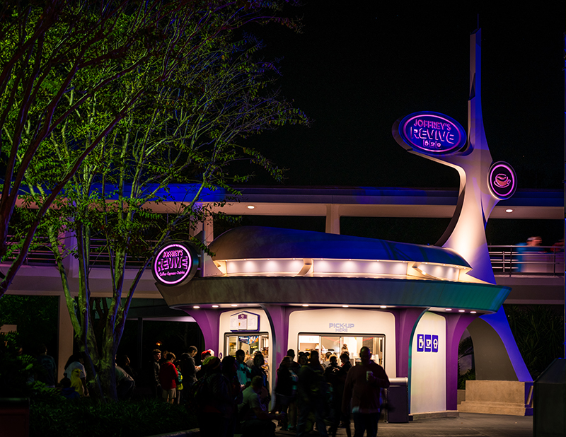
Same goes for the new-ish Joffrey’s Revive stand.
In isolation, I love this. It’s exactly the direction I think Tomorrowland should be heading aesthetically. However, it fits Tomorrowland of 30 years ago, not today.
At this point, it’s tough to see any cohesive plan for a reimagined Tomorrowland.
Rather, it feels like a lot of projects done in a vacuum, without regard for an overarching aesthetic. As if there aren’t plans for the whole land, so instead individual Imagineers are trying to make lemonade out of lemons with project assignments, which has resulted in some fan service for the original Tomorrowland (and Epcot, for some reason).
We applaud these changes, but are they any good if they’re not in service of a greater theme? Which brings an end to the ‘photo update’ portion of the post, and a start to the rambling ‘essay’ portion…
My Thoughts
I’ll preface this ‘essay’ by admitting that I’m a big fan of Tomorrowland ’94. It’s the version of the land from my childhood, and both the ExtraTERRORestrial Alien Encounter and Timekeeper still rank as two of my all-time favorite Walt Disney World attractions. However, as with both of those attractions, the cohesive design of Tomorrowland ’94 is also long gone.
In terms of architecture and design, there’s presently a lot going on in Tomorrowland. There are remnants of the Space Age flourishes and Googie architecture of the original Tomorrowland in the core structures. The majority of the land is still a melange of Art Deco, Factory Pomo, and industrial design, but this is already being peeled back. There’s also a hodgepodge of various other stuff thanks to additions and partial removals.

Soon, there will be TRON Lightcycle Power Run with its swooping organic design and biomimicry features. This style of architecture is unlike anything currently existing in Magic Kingdom’s Tomorrowland, but it does fit the style of Shanghai–both the Tomorrowland there and the sense of fluidity in the city.
How this very distinct design will be reconciled with the rest of Tomorrowland in Magic Kingdom is beyond me. My guess is that it won’t, at least not fully. The best case scenario is probably further stripping away of the Tomorrowland ’94 elements to reveal the Googie style underneath. While that’s certainly not the same as the organic design of TRON Lightcycle Power Run, it could be argued that both at least share some ultramodern bloodlines.
Personally, I wouldn’t mind this. I love Tomorrowland ’94, and think what Disney pulled off there is one of the great reimagining stories, as Imagineers used the same core forms but managed to transform them into something totally different, and totally novel. I also can recognize that there’s no longer any thematic integrity left in this–that version of Tomorrowland is long gone, and would look dated even if it weren’t.
That leaves Walt Disney World with two options, essentially. Further peel back Tomorrowland ’94 and remove the most visually jarring elements that will be at odds with the Tron coaster’s style and call it a day, or restore the original Googie design. (A third option would be going all-in on the organic design, but there’s no way that’s happening.)
My vote would be for the latter option, and not just because I’m a nostalgic yearning for the Walt Disney World of yore. (Tomorrowland ’94 is what I grew up with; I don’t remember the original.)
Rather, because I think futurist design has aged well, and it remains a novelty that’s rare outside of Southern California. There’s a renewed affection for retro Space Age designs, which are at once futuristic and classic. Ironically, that style is today exactly the type of retro-futurism Tomorrowland ’94 was trying to convey when it replaced the Space Age design.
Personally, I think clean design and sweeping lines leading to TRON Lightcycle Power Run, with that attraction’s architecture punctuating the style of Tomorrowland, is pretty much the best case scenario. It’s certainly not perfect, but with the disparate Space Mountain standing tall right next door, there is no perfect solution. At least in this (realistic) scenario, we end up with a Tomorrowland in Magic Kingdom that mostly works on an aesthetic level, and is not a visually jarring mishmash of ideas and eras.
Planning a Walt Disney World trip? Learn about hotels on our Walt Disney World Hotels Reviews page. For where to eat, read our Walt Disney World Restaurant Reviews. To save money on tickets or determine which type to buy, read our Tips for Saving Money on Walt Disney World Tickets post. Our What to Pack for Disney Trips post takes a unique look at clever items to take. For what to do and when to do it, our Walt Disney World Ride Guides will help. For comprehensive advice, the best place to start is our Walt Disney World Trip Planning Guide for everything you need to know!
Your Thoughts
What do you think about the new color scheme in (parts of) Tomorrowland at Magic Kingdom? Any hopes for an overarching reimagining of the land’s aesthetic, or are you fine with Tron Lightcycle Power Run being added to Tomorrowland, as-is? Do you agree or disagree with my thoughts? Any questions we can help you answer? Hearing your feedback–even when you disagree with us–is both interesting to us and helpful to other readers, so please share your thoughts below in the comments!

Thank you for your article — I have been wondering lately what direction they could take Tomorrowland in the future. I grew up with the original (first trip was in ’73), and to my eye, the ’94 re-do never had homogeny to it. Despite the “make over”, there were some areas that remained fully rooted in the original mid-century, Googie aesthetic, like Space Mountain and Carousel of Progress. They couldn’t touch Space Mountain, thank God — it’s too iconic at this point! The original Wedway People Mover cars rode amongst the new tacky girder filled track system — none of it looked cohesive to me. It all reminded me of 20K’s Nautilus — which used to live in Fantasyland so now Tomorrowland lacked distinction as well. These post-industrial, steampunk bulky facades seemed retro fitted to the original show buildings.
It’s not Disney’s fault — they got painted into a corner. It’s futile to try to predict the future, so it was smart to go to a more timeless period for its renovation — but I don’t think it could have been done successfully without going all in — which they couldn’t do. This aesthetic works much better in Euro-Disney’s “Discoveryland” where the Jules Verne-esque sensibility can be done from the bottom up. The Re-Do all looked clumsy to me compared to the sleek, clean, angular lines of the original — which is the direction that I think they should take this area.
I would love to see them pay homage to the original, but to not have it take itself as seriously. The original Tomorrowland looked the way it did, because people back then were really selling the idea that this is how the future would look! I honestly don’t know how much “camp” went into its original design. Googie could be seen as an aesthetic sprinkling the country and now those buildings are being preserved and revered as American treasures. They just dumped millions into the old TWA terminal at JFK and made it into a very boutique hotel — keeping its original design elements intact. I think revisiting this now timeless period would be wonderful and now relevant, given the passion to preserve these structures. It could be a fanciful look at a yesterday’s tomorrow that says “this is how we once thought the future would look… and isn’t it amazing?!” With current technology like fiber optics, LED and intelligent lighting, flat panel displays, projection mapping, etc… it could be done even better than the original.
Googie is uniquely American (which Disney loves) and also very Disney itself. Walt Produced “Magic Highway USA” after all. This incarnation would be nostalgic for folks who grew up with that Tomorrowland and it would be completely new to a generation of kids who didn’t grow up on the Jetsons. Wouldn’t it be amazing if the future ended up looking a little more like that, because this new Tomorrowland actually influenced future designers? Art imitating “life” now becomes reality?
I never cared for Tomorrowland ’94 (hate is only slightly too strong). I grew up with the original, the waterfalls at the entrance sans rocks, Flight to the Moon (later Mission to Mars), America the Beautiful in the Circle Vision 360 Theater, If You Had Wings (If You Could Fly), the WEDWay Peoplemover, Star Jets, Space Mountain, the Carousel of Progress with “The Best Time of Your Life” soundtrack, the Skyway to Fantasyland, the Tomorrowland Terrace (Cosmic Rays) & Plaza Pavilion (Tomorrowland Terrace) is the Tomorrowland that I grew up with and miss.
“However, my personal favorite is the paint above, from the backside of the PeopleMover track. I’m not sure to when this dates, but I’m guessing it predates Tomorrowland ’94.”
That is actually a relatively recent addition. That whole section used to be open like the rest of the Peoplemover track, but it passes directly over the railroad track and occasionally guests were traveling through the smoke from the train. After that wall was added, it was originally painted white, but very quickly became dirty from the constant steam train smoke, hence the new black paint right over where the train passes!