
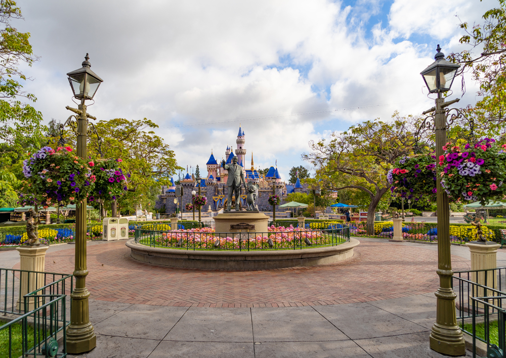
Sleeping Beauty Castle’s New Look
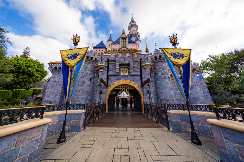
After months, the walls around Sleeping Beauty Castle have come down and the icon has emerged from behind construction scrims, revealing a new color scheme of blue and pink with a bit of pixie dust. In this post, I’ll share my photos of the new-look Sleeping Beauty Castle and offer thoughts on the final results in Flip or Flop: Disneyland.
Since 1955, Disneyland’s castle has been repainted many times, but generally with just minor color variations. If you compare photos from decades ago to last year, you’ll notice it progressively become more colorful, with blues and beiges giving way to pinks. Over time, it had transitioned from a cool to warm color palette.
Imagineer Kim Irvine headed the Sleeping Beauty Castle refurbishment project, and she recently had a fascinating interview with the Los Angeles Times. From that, we learned that this was Irvine’s sixth castle refurbishment, and the most important. Irvine chose to emphasize richer pinks and deeper blues to honor Herb Ryman’s original designs, while also realizing John Hench’s intention to “fix that color scheme” to make Sleeping Beauty Castle more “colorful and bright.” Her goal was to push the color and make it more fantastical without being too cartoony.
The latest update of Sleeping Beauty Castle comes after extensive damage was done to the roof structure of the castle by the 60th Anniversary Diamond Celebration overlays, and also as part of the Project Stardust place-making and crowd-flow improvements.
Work exceeded the scope of what was “necessary” to repair overdue damage to Sleeping Beauty Castle, but with the goal of sprucing up Disneyland ahead of Star Wars: Galaxy’s Edge, it’s fitting that the castle would receive a fresh look. The end result is more of a re-imagining of Sleeping Beauty Castle than a simple refurbishment and fresh coat of paint.
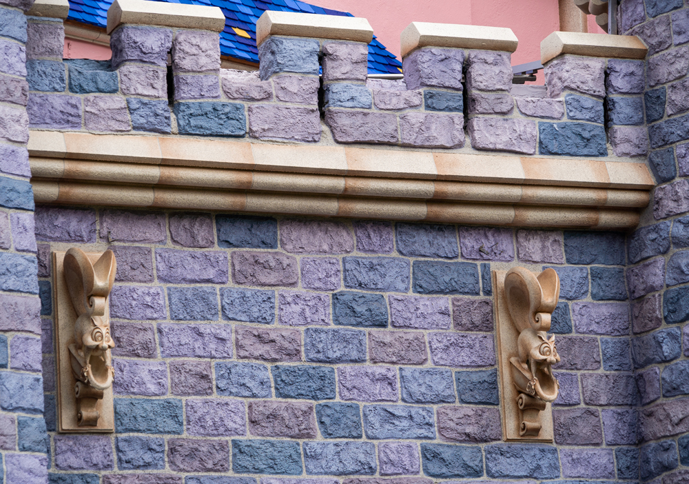
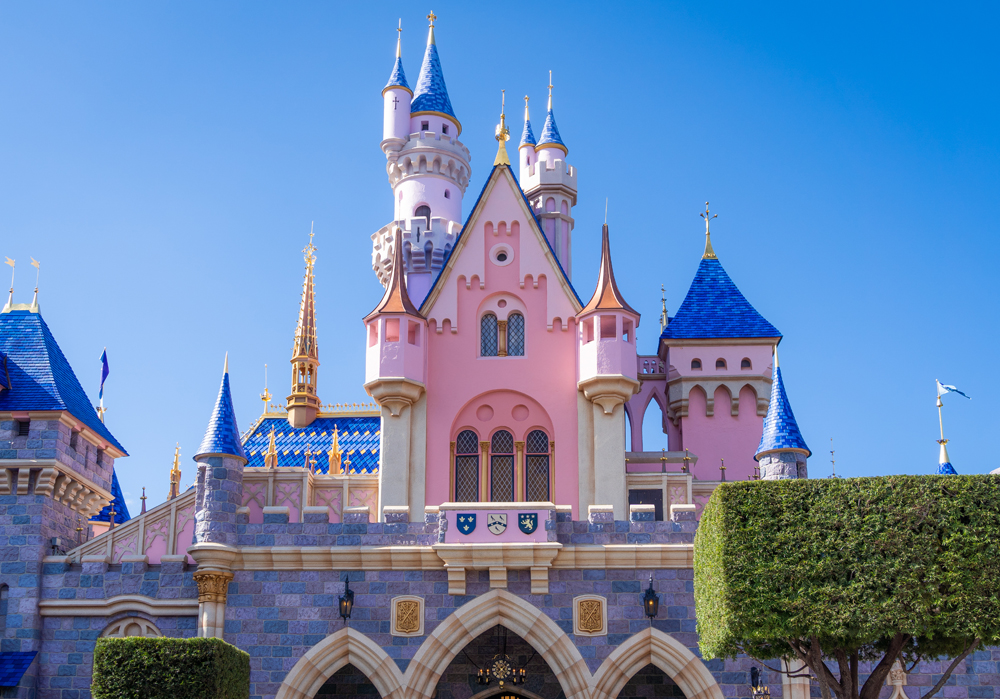
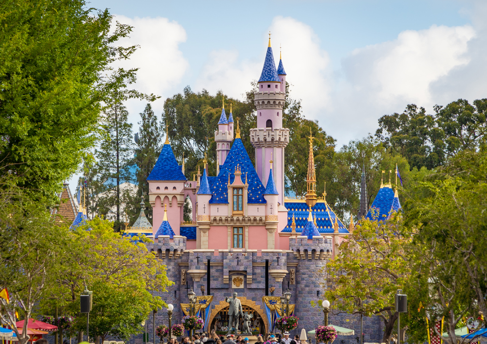
For me, the most noteworthy changes are to the color of the stonework, which is more varied and overall has a cooler appearance. Additionally, the turrets atop Sleeping Beauty Castle now use a deeper cobalt blue and definitely pop more. The classic diamond pattern flanking each side offsets these bright colors.
Topping the towers are eye-catching gold spires, along with gold accentuation elsewhere. The roof’s shingles have been individually painted with weather-resistant coatings and some luster to highlight the color. The facade has been repainted a lighter shade of pink that is, again, not as warm as the previous scheme.
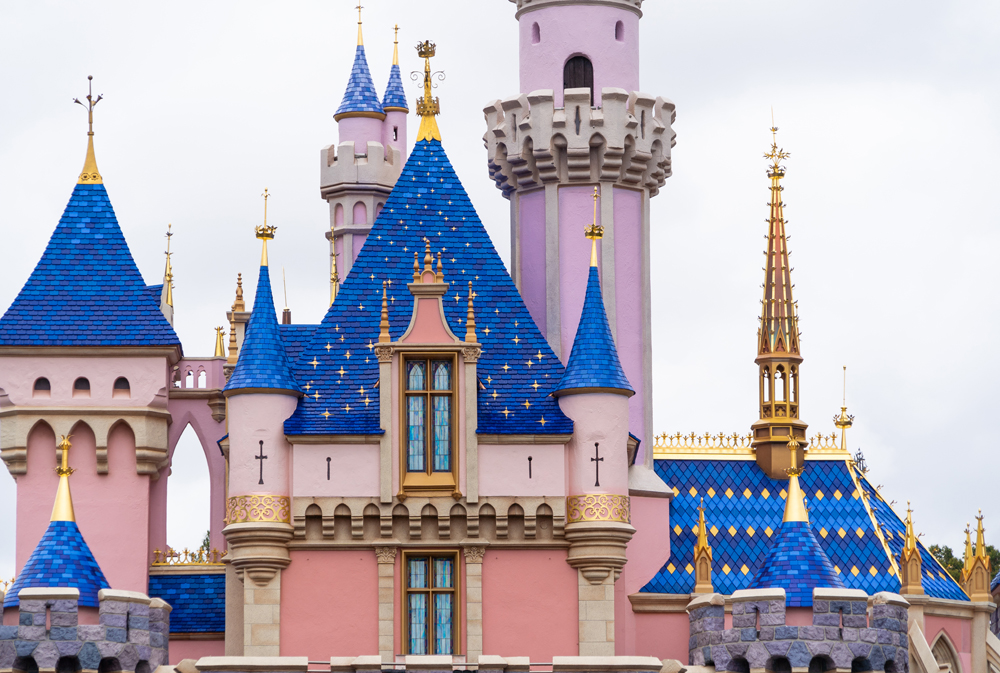
While unnoticeable with the naked eye from a distance, there’s also pixie dust painted directly onto the center blue roof that is very visible from the Central Plaza. This is easily the most controversial of the changes, and is one Irvine had to have seen coming.
While down for the structural repairs, Imagineers experimented with new colors to increase Sleeping Beauty Castle’s perception of height. The shades of pink and blue progressively lighten as your gaze goes up the castle. The idea here is to achieve forced perspective via color, which is something we saw with the Cadillac Mountain Range in Cars Land.
Among fans, this has already been a polarizing update. I have strong opinions on all things Disney, even seemingly insignificant matters, but to be entirely honest with you, my feelings here aren’t especially vehement. To the contrary, there are aspects I like and dislike, and I can understand why the re-imagining has its fans and critics.
I’ll preface this by saying I don’t have degrees in color theory, architecture, design, art, or literally anything that would qualify me to have an informed perspective on this. My opinion is no less or more valid than yours, or any of the thousands of voices online who are strongly for or against the re-imagined Sleeping Beauty Castle. So take all of this for what it’s worth.
Personally, what I like most about the new-look Sleeping Beauty Castle is the increased depth and detail. The repainted lower-level stones draw attention to their texture, and my gaze is naturally drawn upwards from there to the rest of the castle. Other details that were previously easy to overlook have been accentuated with fresh coats of paint, and the end result for me is something more regal.
For me, this is a testament to the overall success of the new color scheme. Sleeping Beauty Castle as a “toy castle” has been the butt of jokes by Walt Disney World fans for years, but now it looks more substantial, and significant. This isn’t about forced perspective, it’s more about the castle having more details highlighted and its textures enhanced. For me, Sleeping Beauty Castle now has a sense of vigor that I found wanting in the warm pinks and blue hues.
In fairness, one of the harshest criticisms of Sleeping Beauty Castle tracks closely with my praise: that it’s unharmonious, has too much going on, or is “dialed up to 11” color-wise. The argument is that this is becoming a common trend among Disney projects like Pixar Pier, Toy Story Land, and Hong Kong Disneyland’s castle. There’s little denying that all three of those projects are visually busy at best, downright garish at worst, and striving to be “Instagramable.”
The Sleeping Beauty Castle redesign is a different story. It is using more and richer colors, and maybe the goal is to make the park’s icon more photogenic. However, it’s not as if colors that clash with its surroundings in Fantasyland are being used, or it’s being “enhanced” to appeal to trendy, ostentatious tastes. At most, the whimsical nature of the castle is being emphasized over the medieval nature.
Moreover, if we’re talking about Disney “trends,” it’s far more common for recent projects to use a gritty, muted, or subdued color scheme than a vibrant one. Look no further than literally every single hotel or restaurant redesign, along with the natural worlds of Galaxy’s Edge, Pandora, and Cars Land. That’s not criticism–I don’t think Imagineering is skewing too much in either direction in the theme parks. It’s simply to illustrate that both approaches are being used where appropriate.
I wouldn’t disagree that there’s a lot going on with Sleeping Beauty Castle, and perhaps too many details have been emphasized. (If anything, this criticism is most valid on the backside, where your eye bounces all over the place.) For the most part, I view exaggerating the castle’s minutiae as a net positive.
Additionally, and this is a matter of perspective, but I do not think Sleeping Beauty Castle needs to act as a transition from Main Street to Fantasyland. Logically, a castle makes no sense there and never will. We accept it because it’s a perfect anomaly in Disneyland’s meticulously themed design.
An exception to the rule that just works, and something that has always been and will always be. For me, Sleeping Beauty Castle is a punctuation mark; the pièce de résistance of Disneyland that should announce to guests they are entering the world of Fantasy when they walk under it.
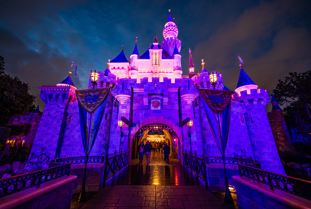
With all of that said, it’s not perfect. One thing I don’t like about the new look is the finish on the roof. Under the “right” amount of sunlight, this produces a soft glow that really makes the castle pop. However, under intense midday California sun, these produce harsh glare that illuminates the roof and makes it appear as if what’s supposed to be wood shingles is actually a metallic surface. For me, that undermines the quaint vibe of Sleeping Beauty Castle.
I also don’t like the pixie dust sparkles that have been painted on the center of the roof. That strikes me as beating the guest over the head with the sense of whimsy that the design should naturally evoke. Everything from the core design to the new paint scheme reinforces the fantastical notion of Sleeping Beauty Castle. No one is going to confuse it for a real medieval fortification from centuries ago, around which Disneyland was built.
Same goes for the attempts at forced perspective. Pointing out their uses of forced perspective seems like one of Imagineering’s trademark things, sort of like HGTV and open concept. It doesn’t work, and just looks like a bunch of shades of pink were used for no discernible reason. No amount of forced perspective painting is going to make Sleeping Beauty Castle appear tall–you’re not going to step foot on Main Street and say, “whoa, it’s as big as Cinderella Castle now!” Quaint and charming are Sleeping Beauty Castle’s strengths, and Imagineers should lean into that rather than trying to make the impossible happen.
Overall, though, you can count me as a fan of Sleeping Beauty Castle’s re-imagined look. It’s not perfect, but I don’t let that be the enemy of good. Even if I had complete creative control over the castle redesign, I probably wouldn’t be totally satisfied with the end result (and not just because I haven’t the slightest idea how to repaint a castle).
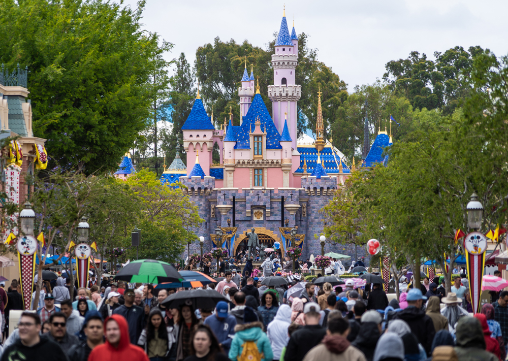
As with most things, Sleeping Beauty Castle does look better in person when viewed with the naked eye, rather than while poring over super-zoom photos on the internet. Even if you don’t like what you’re seeing here or via social media, its appearance might grow on you once you’re in the park. Or not. On the plus side for everyone, nothing is permanent when it comes to Sleeping Beauty Castle, and Disneyland’s 75th Anniversary is just around the corner. 😉
If you’re preparing for a Disneyland trip, check out our other planning posts, including how to save money on Disneyland tickets, our Disney packing tips, tips for booking a hotel (off-site or on-site), where to dine, and a number of other things, check out our comprehensive Disneyland Vacation Planning Guide!
Your Thoughts
What do you think of the new-look Sleeping Beauty Castle at Disneyland? Do you agree or disagree with my review? Any particular details you strongly like or dislike? Any questions? Hearing your feedback–even when you disagree with us–is both interesting to us and helpful to other readers, so please share your thoughts below in the comments!


The best way to make the castle appear bigger would be to remove the trees behind it… they kind of dwarf the castle.
I LOVE it!! Disneyland was my first park at 5 years old and started my love of Disney so this castle has a special spot in my heart and I think it looks gorgeous!
I’ve not been a fan of many Disney parks’ creative choices lately, but I actually think this one looks beautiful. Even love the sparkles.
I like it! But that is coming from someone who has only been to Disneyland once in recent memory, and typically frequents WDW not DL. When we visited a year ago, I remember thinking when I saw it for the first time that it was SO small. And DATED looking. I remember thinking that it looked like it hadn’t been touched since the Park opened, which I realize now is probably idiotic as I’m sure it has been touched up/repainted many times since Walt’s era. However, despite thinking all those things, I loved it for what it was, just seemed to fit in with the petite-ness of the park, and also the dated-ness had a historical charm to it that you just don’t really feel at WDW. If that makes any sense….that being said, I like the new look too!
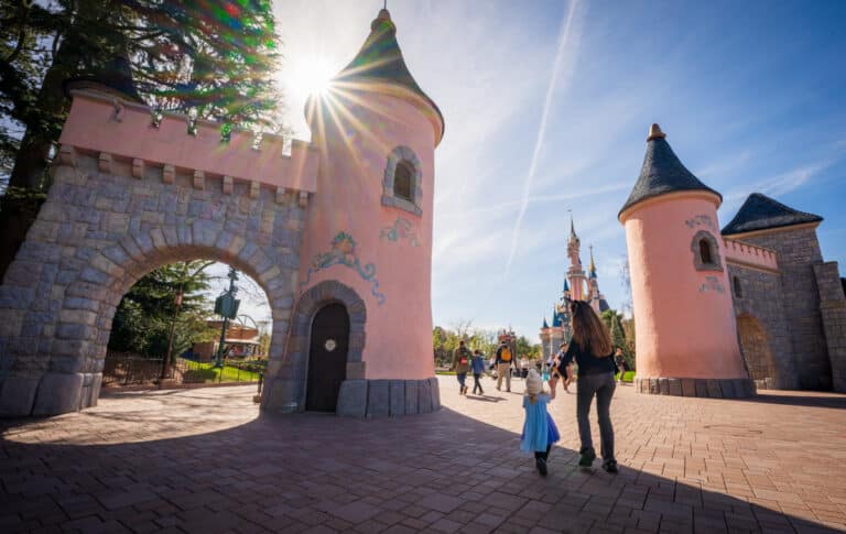
I actually like it! I like the whimsy but I agree with Tom’s statement: ‘No amount of forced perspective painting is going to make Sleeping Beauty Castle appear tall’. They went a bit crazy with the different pinks. But I’m not opposed to pink in general given that I find Disneyland Paris’ castle the prettiest of ALL Disney castles (also the coolest because DRAGON!) 🙂
With the projecting mapping on Cinderella’s castle every night, I can’t imagine we’ll see this drastic of a color scheme change at Disney World anytime soon. So, now fans of the muted-colored castle or the brightly-colored castle can just visit either park.
Tom’s photos generally make everything look amazing. That being said, I expect this to look even better in person. If not, then I may be disappointed. But as a WDW vet, DL has a charming but clearly diminutive castle (but proportional to its neighboring Matterhorn); this is the first time I have looked at the castle and thought that it looks stately.
So in photos, it’s a win in my book. Nice article and as always, amazing photos!
I can appreciate the effect they tried to achieve, but IMHO, they pushed it a little too far!
The stonework in particular looks gorgeously done. I can’t wait to see it in person! From the photos, I’m not a fan of the pinks and the blues look too heavy — but then again, I’m also not a fan of the pinks on DLP’s castle, or the reds/blues of the SHDL castle. The stonework looks nice and sophisticated, and with that, the overly colorful upper half of the castle seems out of place.
Most real-world castles are not quite so colorful. I think I’m a fan of the Cinderella Castle a little more (and even Beast’s castle), because those look like real-world castles BUT NICER. Just like everything in a fairytale – it’s real life BUT NICER. It’s what makes us want to believe it’s real – it’s almost like our world, but everything is just lovelier. For me, the SHDL, DLP, and Disneyland castles, however, are not “real life BUT NICER,” they’re clearly from the pages of a storybook.
But these are just my two cents!
I agree with you Melody. In DLP’s case they intentionally went with something different than a real-world castle because there are many, many of those already in France! So I think the “fanciful” design works best there. But that is not the case in America, so I too think Cinderella Castle works better here.
My family and I were there on Sunday and it looks great in person. We did the castle walk-through exhibit as well and it looked pretty great (I understand it got refreshed as well).
I worked at Disneyland (or, “The Park” as we called it) back in the “Walt era” of the 60s. If this new façade had been done back then, no one would have questioned it. We could hardly wait to see what he and the Imagineers would do next – no matter how different or unusual it seemed to be – and we enjoyed it when it came to fruition because our state of mind was always one of whimsy as original cast members.
How critical we’ve become. Times now seem to call for statements reflecting discomfort and resulting analysis of minutia. It seems to emanate from a deeper personal sense of on-going disappointment, as though something of one’s past has been taken away (something adulthood very often does to whimsey). We never felt disappointment, even when something was removed, changed, or something new added. We were, and I still am, excited about changes and looked forward to whatever might be next. There are certainly things that have required the utmost criticism over the years – such as delaying the A+ maintenance the Park is known for so that certain executives could claim their annual budget bonuses (as Marty Sklar and I would talk about). But the pervasive critiquing of every small detail that now occurs seems to be just as detrimental to the magic, if not more so, then the thing itself that folks seem to feel an impetus to critique.
Kim – it’s beautiful. Thank you for all you’ve done over the years and your hard work to be one of the keepers (along with Tony and some of the others) of Walt’s, and our, whimsey…(I’ll send you an email under separate cover.)
Rory
Another way to look at it would be that Walt and the first couple generations of Imagineers did such an excellent job with Disneyland that they elevated the theme park to an art form, and one worthy of criticism.
This isn’t to say some criticism is nit-picky or overdone, but art criticism has existed for ages. The work of Imagineers and other decision-makers is hardly infallible, especially when plenty of contemporary changes are made less with an eye towards their artistic merits and more so commercial ones.
Rory,
What a great perspective! That must have been awesome to work their during the Walt era. I think Kim nailed whimsy. It’s definitely different, but if there’s going to be a change, shouldn’t it be? I’m excited to see this after the initial star wars crowds have died down a bit.
Dana
Thank you Rory for you perspective.
I like the paint the job.
Saw it in person last week and it looked great!
I actually think it’s beautiful! The slight variations in brick colors are gorgeous and add texture to the castle. The colors look great, I can imagine Sleeping Beauty living there.
Not a fan of the pink as it looks too much like birthday cake (reminiscent of the Cinderella Castle cake). However, I do like the stonework on the bottom half.
I don’t see why they didn’t add another level or a few more spires when doing the renovation. Disney is constantly changing things when it suits their purpose, no matter how we feel. The most recent being the decision to remove the Walk Around the World stones, and then insult to injury, charging $10 for a replacement souvenir stone (which, btw, I did get). See, that’s how easily we adjust to change. We’re even willing to pay for something we feel we already paid for.
Interestingly, bright/garish colors are not all that historically inaccurate. I visited Stirling Castle a few years ago right after they had re-done the lime rendering and it was a bright enough yellow that the tour guide brought it up in the tour (I think it has mellowed a bit since then). Craigievar is often cited as an example of a bright pink castle that may have inspired Disney. I don’t think I’ve seen an example where multiple colors of lime wash were used on the same building, but I guess they could be bright.
My first thought was that the roof work and additional whimsy highly resembled Le Château de la Belle au Bois Dormant.
I personally think the redecoration is an improvement, but it brings with it a moral dilemma: are we now saying that preserving the heritage of Disneyland isn’t important? What makes this ok, while razing the castle to the ground and rebuilding bigger and better would be unthinkable? DL’s castle is objectively the least impressive, but (compelling) arguments for retaining it involve the preservation of history (and while DL is not a museum, it’s closer to one than any other Disney park). Is it just that repainting is reversible, whereas demolition is not? Either way, it feels like some somewhat arbitrary lines are being drawn.
My initial thought about the richer deeper hues is that it will take much longer for this paint color to fade in the strong California sunlight, therefore extending the need to repaint in the future. So, perhaps it’s a cost effective measure?
That being said, I do like the new color scheme. I think it gives the castle much more presence, character and whimsy.
Haven’t been there, but against the green foliage it looks enchanted.
I hope Disneyworld doesn’t follow suit. The color and texture in the bottom bricks is nice. And that’s pretty much it, I hate the pink and the dark blue but then again I am not a five year old little princess !
From the photos, it looks gaudy. Maybe it looks better in reality.