New Look!
It seems like the look of so many things in the parks is changing lately: from Condor Flats becoming Grizzly Peak Airfield to Disney’s Hollywood Studios losing its hat to the new hub in the Magic Kingdom. Now, you can count the design of DisneyTouristBlog.com among those changes (okay, probably not quite as big of a deal as those changes to…well, anyone).
I spent the better part of the day yesterday working on the new design, prepping the existing framework of the site, launching it overnight, and then staying up really, really late fixing some of the bugs. You’ll notice there are still some (okay, a lot) of bug remaining. I have a good amount of tweaking still to do.
What do you think? The purpose of this change was to address the many comments we’ve received from readers about reading on mobile. I was reluctant to change to a “responsive” (mobile-friendly) design because I, personally, didn’t mind how the old layout looks on the phone, but I realize that’s the direction the internet is going…so it was time for a change. Keep that in mind. Otherwise, any comments or feedback? I’d love to hear what you think, as well as other ideas.
Note that I’m not totally sold on the current look, so we’ll see how it goes for a couple of days and then decide if additional, larger changes need to be made. Also note that I have absolutely no experience in web design or any of this stuff, so literally everything I do here is a matter of reading about how to do something, trying to change it, breaking it, then going onto Google and frantically trying to figure out how to change it while freaking out that I’ve ruined the site. Point being that it’s been a time-consuming and slightly stressful process, so please be kind (yet still completely honest). 🙂
UPDATE: Thanks to everyone who has left a comment here or on Facebook. A lot of the things you have suggested are things I plan to address. I don’t have the time (or knowledge) to make all of the fixes right now, but they will come soon. Here are some of them, point by point:
- The old logo will be back in an altered form. I made it myself and forgot some of the steps of how to do it in Photoshop, but there will definitely be something to give the page character. I want this blog to be personable, not professional or sterile.
- The text color in the posts will be changed to black.
- The post titles will be bolded, enlarged, or something so that they stand apart from other text.
- Dead space will be eliminated; in particular, I think there’s way too much empty space around post titles. I’m not sure if I can kill all the dead space around the edges, but I’ll see what I can do.
- The multitude of problems with the menu bar will (hopefully) all be fixed.
- I’ll see what I can do about images displaying larger (a common complaint), but on a normal screen, photos are larger with the new look–849px v. 614px before. (This new size will only be visible going forward, so starting with this post.)
UPDATE 2: If you saw the website on Sunday (3/22), you might have noticed a lot of the issues above were addressed. Unfortunately, it came to my attention that a number of older, almost exclusively long posts were not consistently loading with the new site, so I’ve reverted to the old site. Aesthetics are nice, but content is key. I still want the website to be responsive, but in a manner that doesn’t cause issues with content. So it looks like I’m heading back to the drawing board. In case you missed it, here’s a look at the new logo I created:
![]()
These are just some of the changes that will be implemented once I have time and can figure out how to make the changes. Just thought I would address this now for those comments to which I haven’t responded, or future comments you might consider leaving.
Again, thank you all so much for your feedback!
-Tom
love the blog! lots of comments on design, always. one more: the top menu “planning, dining, etc” and the menu below that, “home, trip reports, etc” don’t quite align. not that they have to, but I think it is a bit unclear which items are in which menu. and then the bottom menu drops away as you scroll. I like the clean look, but agree, it has less personality than the previous one. it comes off a bit flat. it doesn’t seem to reflect how clever and fun the blog is!
I personally really like how simple the new look is. It could use a little pizazz, but it’s still much better than the old look in my book. I do suggest a darker color font, though!
The white background and light coloured font make it a bit difficult for me to read. Personally, I prefer a coloured background versus white.
The bottom on the logo “Tourist Blog” isn’t visible when you scroll down because it is white text on a white background. But I do like how the navigation bar floats when you scroll down. Big fan of your site, keep up the great work!
I think the new look has a lot of potential! The biggest thing I would work on is getting your logo in the top left corner where it says “Disney Tourist Blog” because right now the words are messing up the top bar layout/ making it too chunky. I would also move your facebook column above the tags column since the tags are so long. Last immediate thing that I think would help is shorter story snippets, especially after the first 2 stories then move into much smaller boxes.
I’m self-taught with graphic and web design too but trust me, you pick it up quickly! Good luck! 🙂
I like it, Tom! I do think the old version felt “warmer” with its tones, but this looks very professional.
Thank you for doing all the construction behind the scenes and not having a picture of a giant crane sprawled across the pages ala Disney. My vacation planning experience was not ruined. 🙂
Most importantly, your content is great!!! That doesn’t change no matter what the website format.
Looks pretty good!
I’d agree that a logo, or photo, should be put up on the top bar- your shots are fabulous and should be featured wherever. I don’t know if this theme comes with a rotating header option, but if not, there may be a plug-in that could work.
The one other issue I have is- there’s no link to your other site! I clicked a link the other day that took me there, and I was enjoying it as much as this blog! Bring that back!
Other than that, keep tweeking until it’s how you like. It’s your blog, we’re just living in it!
Well done in doing your own coding. I’ve been there and done that but it is worth it to control your own site! Like the bright colors but the colors keep changing as I post this so I don’t know what you are going to choose. The suspense is killing me! So far, I like the light blue/blue combination best. The title bar is a bit buggy – doesn’t scroll consistently when I scroll and seems to lag and maybe even slow down the site? The title of the blog also overlaps with and covers us a bit of the the “Dining” subheader on the title bar when scrolling. Not sure about the three column format – it takes away real estate from your posts and makes your gorgeous photos smaller. I’d devote a wider column to the post and keep a single sidebar. Overall, can’t wait to see how this all shakes out. Redesigns rock.
I like the more minimalist look as well. My only two critiques is that there is a lot of space between the post title and the photo where the post starts- adds a lot of unnecessary space. (But, that could just be my browser.) Also, the green might be a little too bright. If it was solely on the top menu bar it would be fine. But as I’m typing this, the tags on the right side are burning my eyes. :):):)
also, just out of curiosity, what host/program do you use? wordpress?
The space thing is my biggest complaint right now and I’m desperately trying to fix it. It has been REALLY bugging me, and I think it’ll require custom css, which is scary territory for me.
As for the colors…better now?
I use Dreamhost for hosting (they’re awful) and WordPress for the site.
I used to have to zoom in, but this is easier. I’d like to see the options of how to find different parts of your blog, like before. I’m the type that won’t go pushing buttons trying to find xyz; if I can’t easily see it, I typically just won’t bother. New readers may not know all you have to offer them with the current header you have. (is ‘header’ the right word? I’m talking about the physical top of the site)
That menu is still there on the normal site (at least what I think you’re referencing is). On mobile, click the three little lines to see it.
Okay, I see it.
Better on mobile, worse on web. The green is too harsh and the layout is just bland. Sure, maneuvering is a bit easier, but I think it needs more tweaking. You’re on to something, though.
I pretty much only read on mobile so I like the new look. Much easier to read on my phone.
Call me old fashioned but I really like the old way better. The new does show up better on the mobile browser but overall I do miss the previous look. This one just seems, basic, not in any way trying to be rude.
Otherwise I love the site. Keep up the good work!
Owww, my eyes. The greens got to go 🙂
Better?
Big improvement. I agree with the other Mark, that green was too bright
Great update! Clean, minimalistic look! I love that it has an “uncluttered”feel to it.
I agree with Jay, a logo would be a great bow to tie it all together. We would love to help with a logo if you lean that way. (My wife is a full-time Graphic Designer!)
I agree about the logo and am trying to figure that out. Right now my focus is more on usability stuff, but I know that’s what will ultimately be the “bow.”
I might reach out. Thanks!
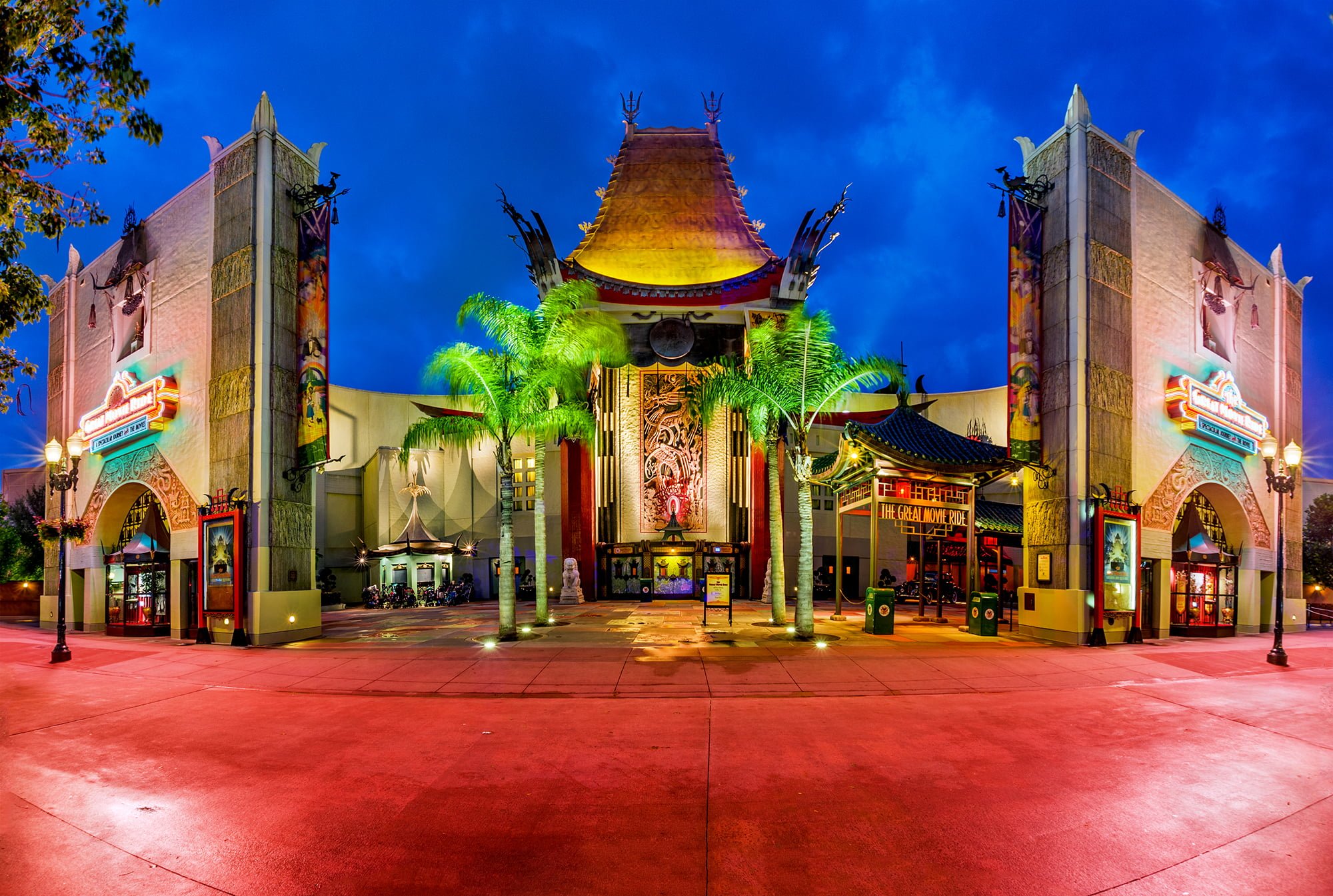
Tom… I just wanted you to know how much I appreciate your blog. It is always well written and filled with wonderful beautiful photos & tidbits. This photo of the Chinese theater is a perfect example.
The truth is… the content is more important than the “look” to me. Go for the convenience of mobile! As that is how most access it!
Just wanted you to know that other Disney Travel professionals recognize your work. Keep it up!
Without a doubt, content is more important. I just want a good user experience, as the UI is something you have to put up with while enjoying that content! 🙂
I like parts and I think there are parts that need improvement. You’ve already said it’s sort of a work in progress, but I think it’s a great start.
I like that the titlebar hides and follows you around as you scroll. I agree with KI, the fact that you went with Responsive web design rather than a different mobile page, or a real clunky full-desktop experience, is a great choice, everything looks nice on an iPhone.
That being said, on my desktop there are some pretty wide gutters on the sides that’s causing the “Top 10” menu item to wrap around to a second line, leaving a lot of blank space next to it. If you could expand the sides a bit more leaving less purely empty whitespace I don’t think that’d be the worst.
I think the titles on the main page need to be bigger and bolder, I sometimes thought they were just in-line text advertisements that other sites do sometimes.
Also, I don’t think it’d be the worst if you got a logo for Disney Tourist Blog (or at least a stylized version of the name) rather than just using a text box. That’s something that instantly speaks to me as a more established website rather than a pet project.
I realize that’s a lot of stuff, but honestly they’re all pretty nitpicky since overall the site is nice. I like the color scheme, its bright like a Disney site should be. Things are easy to read, there isn’t an over-abundance of weird buttons all over the place, etc.
Literally every single thing on your list is an item I’m trying to address, so I don’t think it’s nitpicky at all. Just affirms that I’m not being overly critical. Now to see which things I can actually figure out how to fix…
Stay tuned!
I love it! I don’t find it sterile at all. A little “cleaner,” maybe, but also brighter and more modern/up-to-date.
I just looked at the website on my Iphone and I think it looks much better on my phone than it did before.
I like the old look better at this point. Maybe you are still tweaking it, but it’s kind of sterile/generic.
Yep, I definitely agree that it looks sterile. I’m trying to figure out how to solve that now…
Not sterile. Cleaner. I like it. Maybe just a nice banner of one of your resort pictures
This. Something similar in layout to the touring plans blog banner would look great.
I prefer the old site as well. It was more…..fun. Like he/she said, this is pretty sterile.
Oh and I never minded browsing the old site on my phone……maybe it didn’t work so well on older phones?
Brett